Dream Traveler — A Gamified Sleep App Tailored for Working Professionals
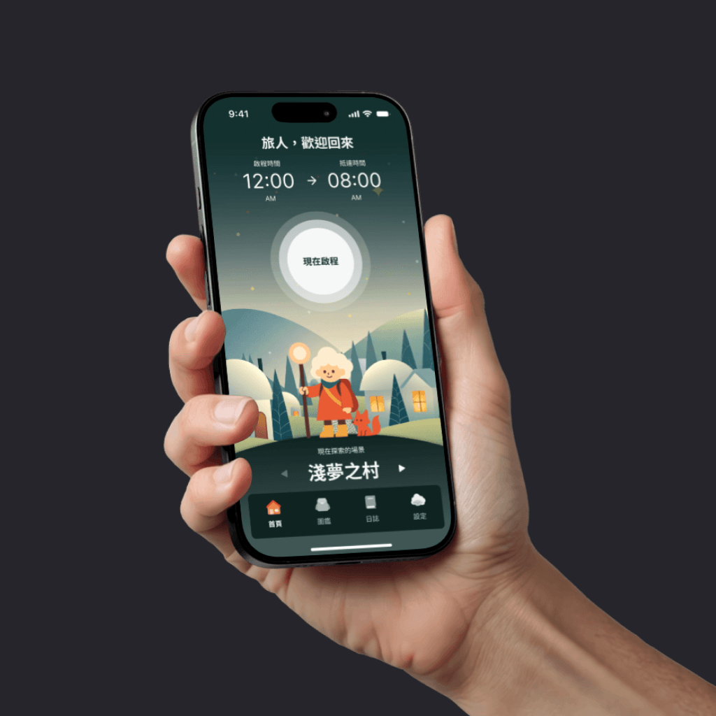
This is the graduation project from AAPD's 3rd UI Design Bootcamp — from competitor research to a complete UI design, with the help of AI tools, producing a gamified sleep-aid app. The project was ultimately selected for the "AAPD × Hexschool | Design-to-Frontend Product Development Camp," where a front-end engineer developed static pages for key screens, further validating the UI design's feasibility and soundness.
2025/07 - 2025/08
- Product Designer ×5
Competitor analysis, user flow, homepage UI, prototyping, and design handoff.
Background & Problem
Current Situation Analysis
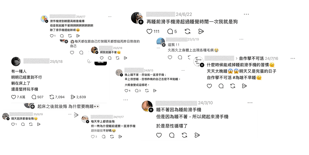
- According to a 2021 survey by the Taiwan Society of Sleep Medicine (TSSM), the average sleep time in Taiwan falls well short of the 7–9 hours recommended by the American Academy of Sleep Medicine (AASM), with nearly half of the population reporting poor sleep quality — with "using phones before bed" being the most common culprit disrupting sleep. This led to our core design challenge: How might we help users break the habit of late-night phone scrolling and build a healthy, regular sleep routine?
Average Sleep Duration
0.00 hr
Poor Sleep Quality
0%
Uses Phone Before Bed
0.0%
Competitor Analysis
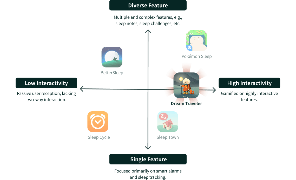
By analyzing competitors with AI tools such as ChatGPT, Gemini, and Perplexity, we found several sleep-aid apps already on the market — such as SleepTown and Pokémon Sleep — that help people put down their phones and go to bed through a mechanic where users "sleep to earn rewards, but fail if you leave the app to scroll". While the "collect them all" gameplay has been well received, over time, other issues have gradually eroded the user experience:
Too Much Interaction and Stimulation Before Bed
Although intended to help users fall asleep, the product actually keeps them staring at their screens before bed through complex operations and progression-based game mechanics, leaving the brain overstimulated and ultimately delaying sleep.

Pokémon Sleep: Gamified with ingredient collection, character-raising tasks, and cutscenes.

BetterSleep: A huge library of audio and custom mixing that often leads to decision paralysis.
Rigid Penalties with No Flexibility
Punishing users the moment they miss a target feels overly rigid for today's varied schedules (such as shift work and overtime), often leading to frustration and app abandonment.

Sleep Town: If users fail to check in by the set wake-up time or leave the app mid-sleep, the building collapses—leaving no room for unexpected situations.
Pokémon Sleep: A fixed settlement cycle makes it easy for users with irregular schedules or shift work to miss the reset window, interrupting their progress.
Lacking Actionable Guidance
Products often stop at offering sleep aids and data logs without translating them into concrete improvement plans.

Sleep Cycle: Focuses on quantifying physiological data but offers no actionable guidance.
BetterSleep: Focuses on auditory relaxation but lacks guidance for sleep behaviors.
Product Positioning
Summarizing the research above, we defined four main design hypotheses and their corresponding feature directions, which became the guiding principles for our product architecture.
| Design Hypothesis | Feature Idea | |
|---|---|---|
| 1 | If quitting the phone could be made fun — through low-stimulation gamification rather than complex progression tasks — it could deliver a sense of achievement and reduce the habitual urge to open social media. | Moderate Gamification: Rewards and feedback from sleep exploration and collections boost motivation and engagement. |
| 2 | If sleep goals could be adjusted flexibly to fit users' actual routines, it could effectively reduce their sense of defeat. | Flexible Sleep Time Settings: Personalized schedule adjustments that replace "punishment" with "staged rewards," meeting the needs of shift workers and those who work overtime. |
| 3 | If abstract data could be turned into easy-to-follow, concrete, actionable guidance, users would know clearly how to adjust their routines — and no longer feel lost about improving their sleep. | Charts & Actionable Guidance: Visualized sleep-log charts paired with guidance-oriented analysis, helping users address the real issue while avoiding anxiety over their scores. |
| 4 | Users feel unsettled while breaking the habit, and need an alternative way to relax that fills the time their phone used to occupy. | Using Music to Build the Habit: Offering a variety of sleep-aid music to ease the discomfort of building a new routine. |
Product Principles
Target Users
Built for working professionals who work overtime, take shifts, or keep irregular schedules — digging deep into the psychological motivations and behavioral needs behind their "revenge bedtime procrastination."
Emotional Connection
Replacing dry logging with a dream-adventure story, turning sleep into something to look forward to.
Simple Flow
A streamlined, intuitive bedtime flow that stays immersive without losing functionality.
Brand Visuals
A warm, endearing visual language and character design that builds a highly recognizable brand identity.
Design Decisions
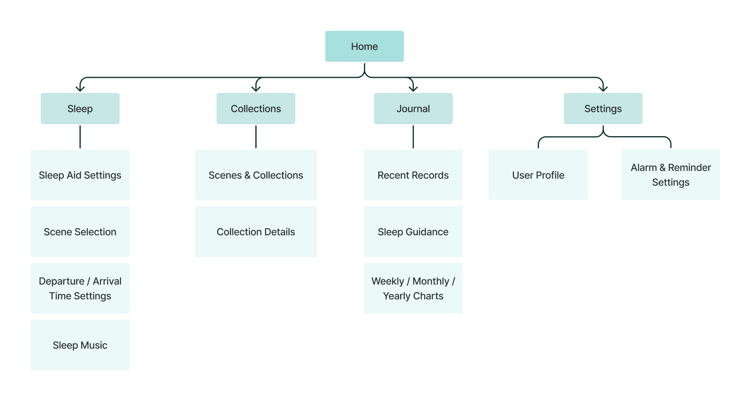
Main Features & Flow
- Onboarding
- Brand Loading Screen → Game Introduction → Guest / Sign Up / Log In → Tutorial → Home
- Sleep Feature
- Set Sleep / Wake Time → Choose a Scene → Confirm Sleep Music → Start Sleep → Pause / End Sleep → Earn Mileage → Earn a Treasure → Home
- Enabling Notifications / Reminders
- Settings → Set a Bedtime Reminder
- Viewing Sleep Records
- Journal → View Sleep Data
- Viewing the Collections
- Collections → Choose a Collection Scene → View Collected Treasures
Core Features
1Journey (Sleep) Feature
- Choosing a Dream Scene / Path: Sleep is reimagined as a "dream journey." There are four scenes, each with three paths. Every traveler sets off from "Shallow Dream Village(淺夢村)" and picks one of three paths to enter their dream. With each night of stable sleep, travelers accumulate "Dream Mileage," gradually unlocking other scenes — mysterious new worlds like "Deep Slumber Valley(深眠幽谷)," "Memory Forest(記憶森林)," and "Floating Isle Frontier(浮島邊境)."
- Setting the Journey Time: This covers the departure (bedtime) and arrival (wake-up) times. An initial schedule can be set during the onboarding tutorial, but the app confirms the time with the traveler again before every departure, allowing flexible time settings.
2Collecting Dream Treasures
When you end a sleep session, you'll receive a treasure left behind on your journey. These dream fragments hold the memories and emotions of the night before, and their rarity shifts with how stable your sleep routine is — the better you sleep, the more precious the dream treasures you'll uncover.
3Tracking Sleep Journal
Through your daily sleep journal, you can review the quality and status of every journey. The system compiles your sleep data across weekly, monthly, and yearly timelines, helping you understand yourself through long-term trends and gradually build your own healthy sleep rhythm.
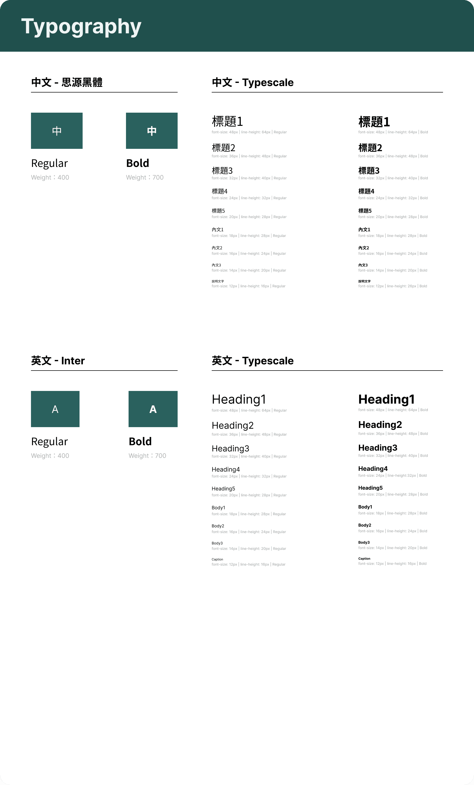
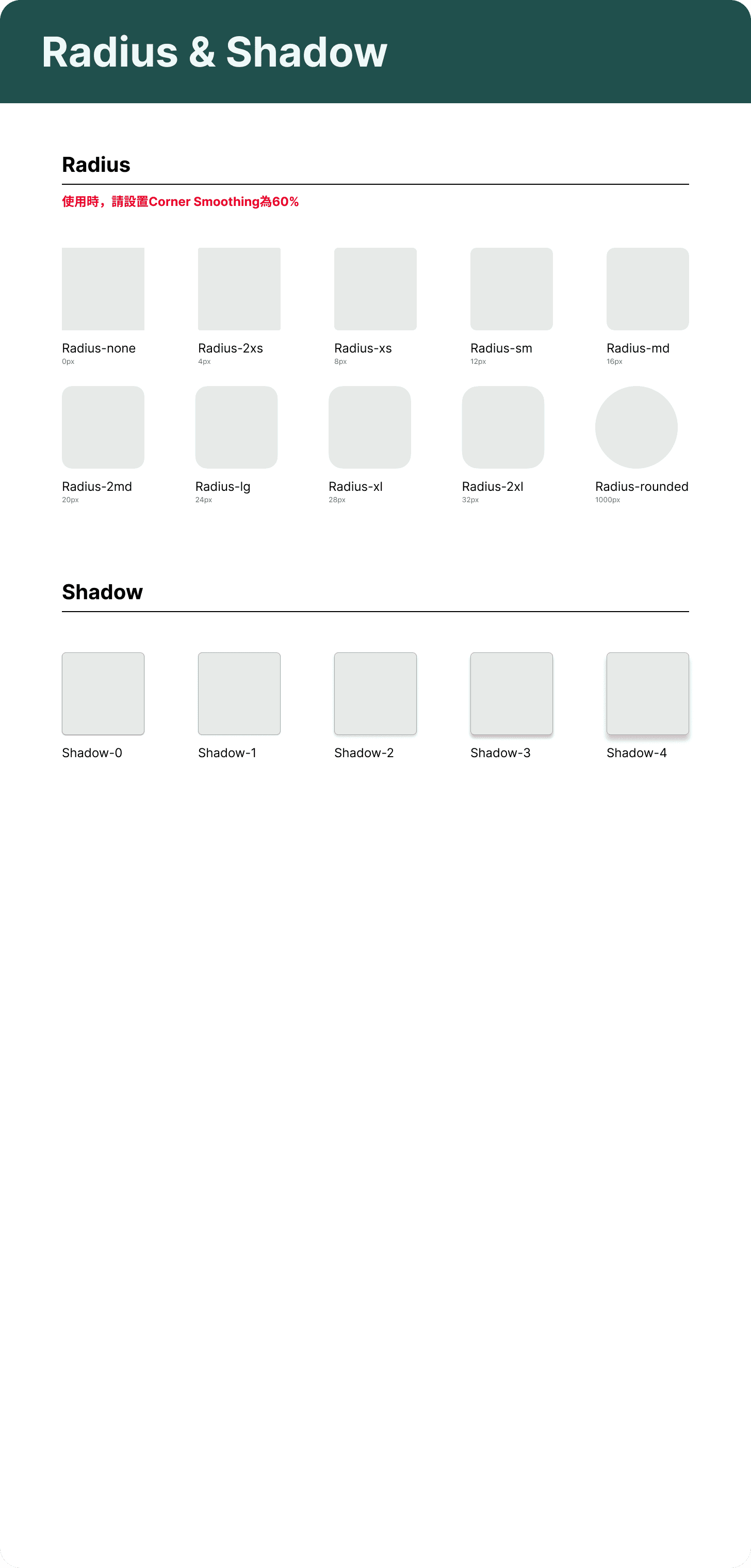
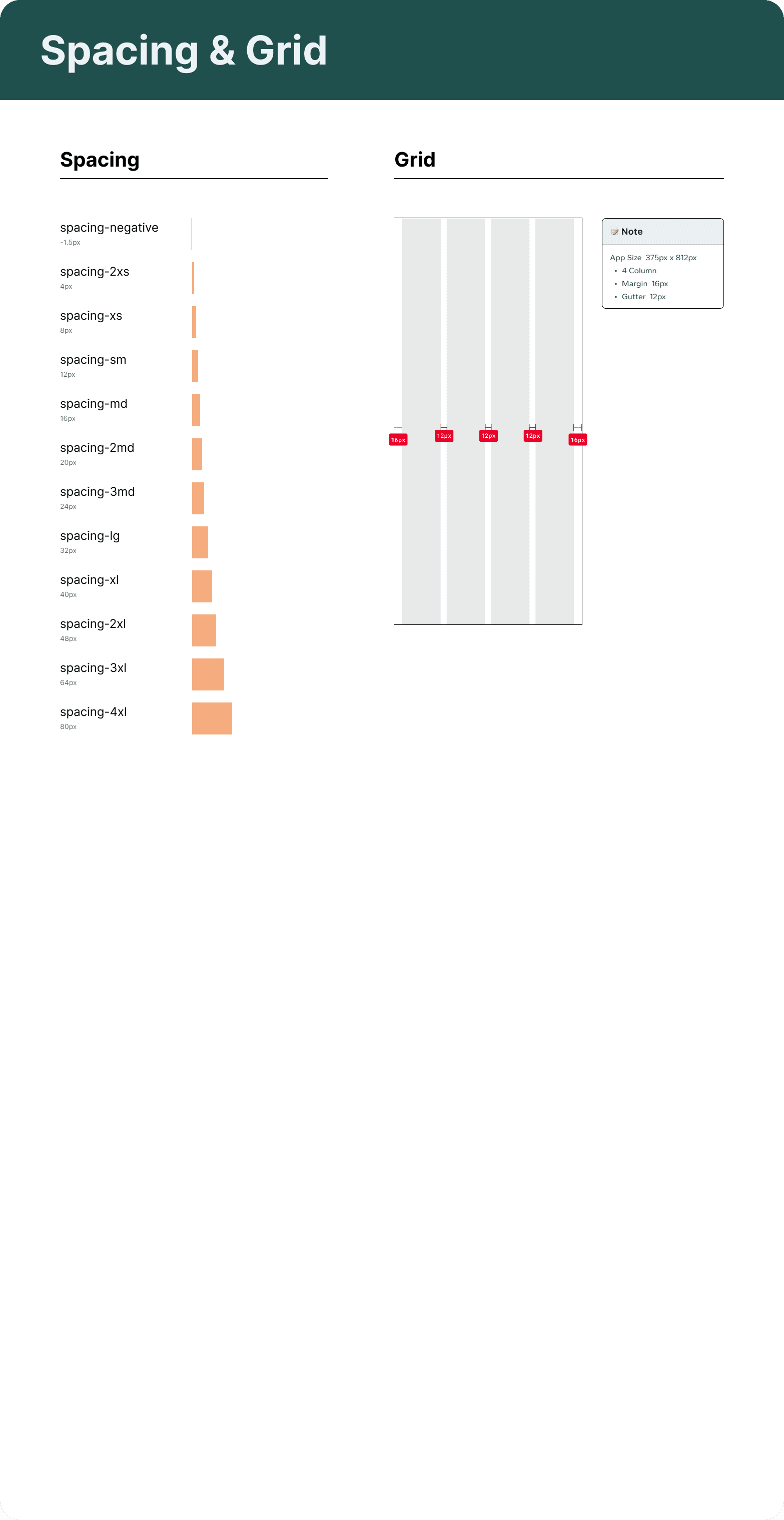
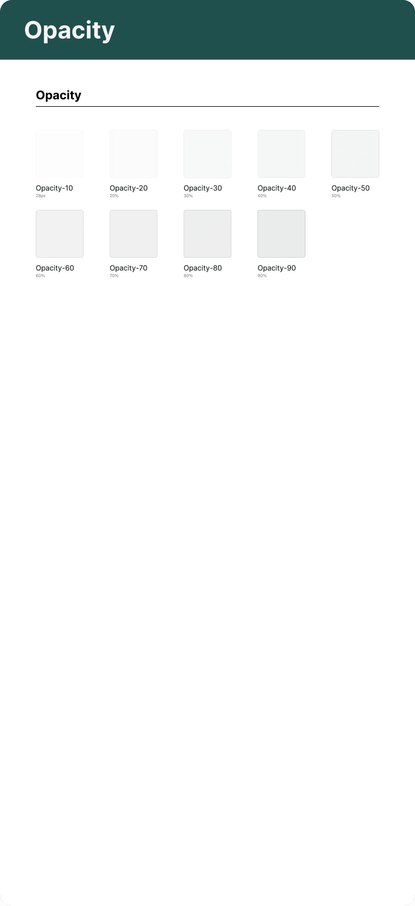
Design System & Visual Design
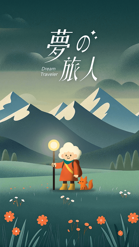
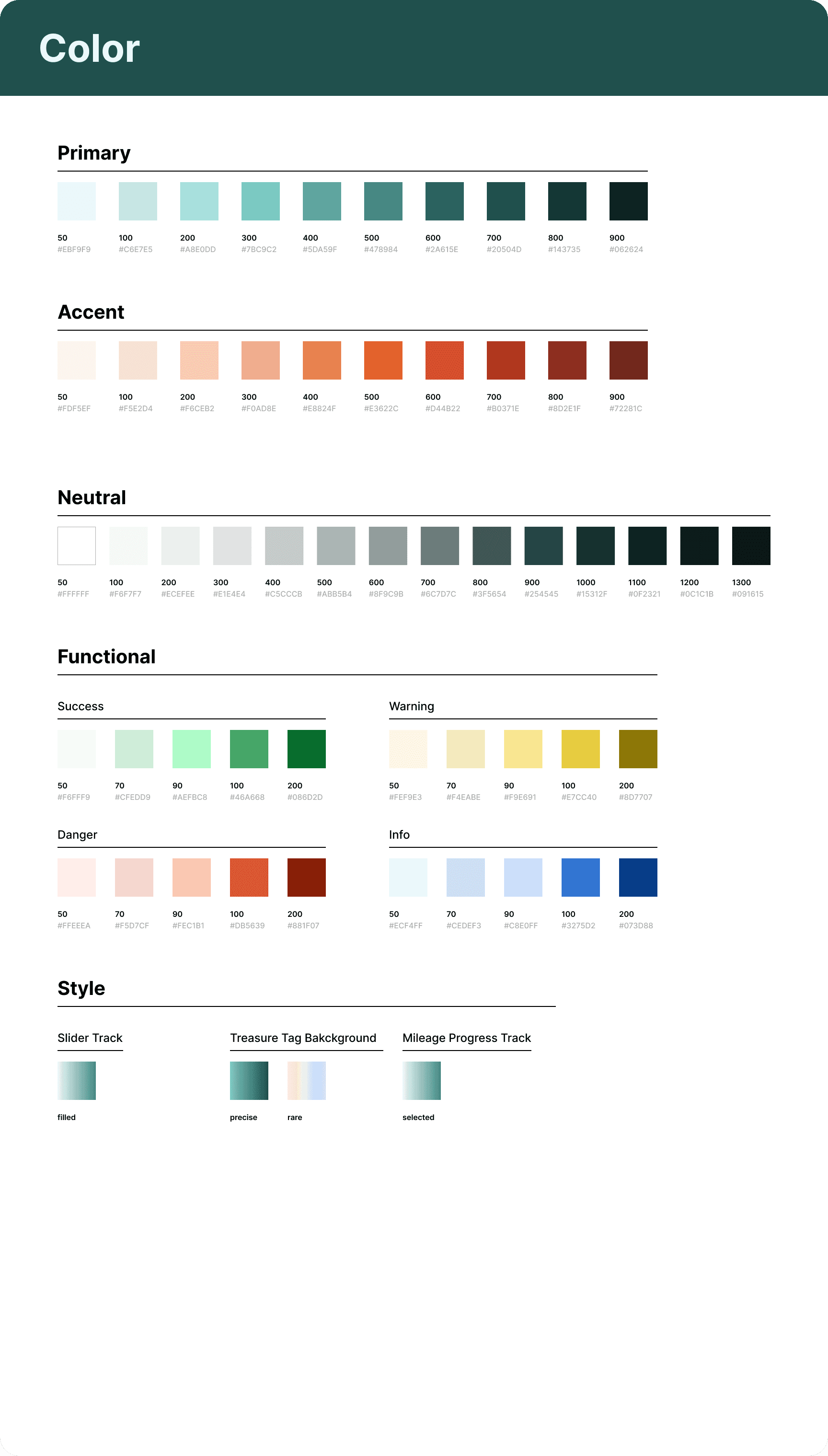
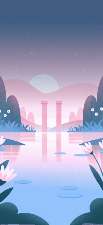
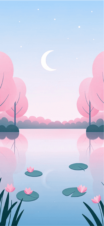
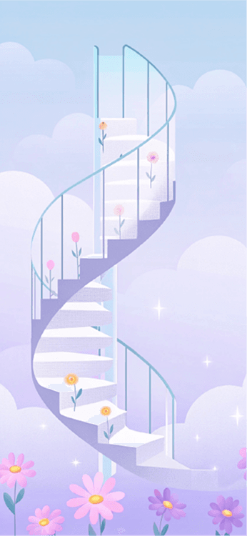
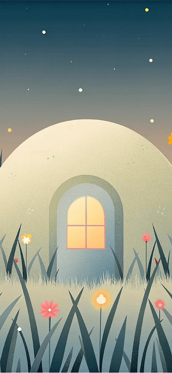
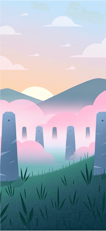
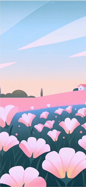
Dream Traveler is built around the core concept that "sleep is a journey through dreams," creating a gentle, whimsical dream world. The protagonist, the "Dream Traveler," features cloud-like white hair and a glowing staff, journeying through dreams alongside a little fox companion on a nightly adventure. The overall visuals were generated with Recraft, using low-saturation colors and vector illustration aesthetics, evoking a fairy-tale-like innocence and a deeply calming, therapeutic experience. Guided by the companionship of characters and scenes, users step gently into their dreams — gradually discovering inner peace and the true meaning of sleep through exploration.










Design Iteration
1Onboarding
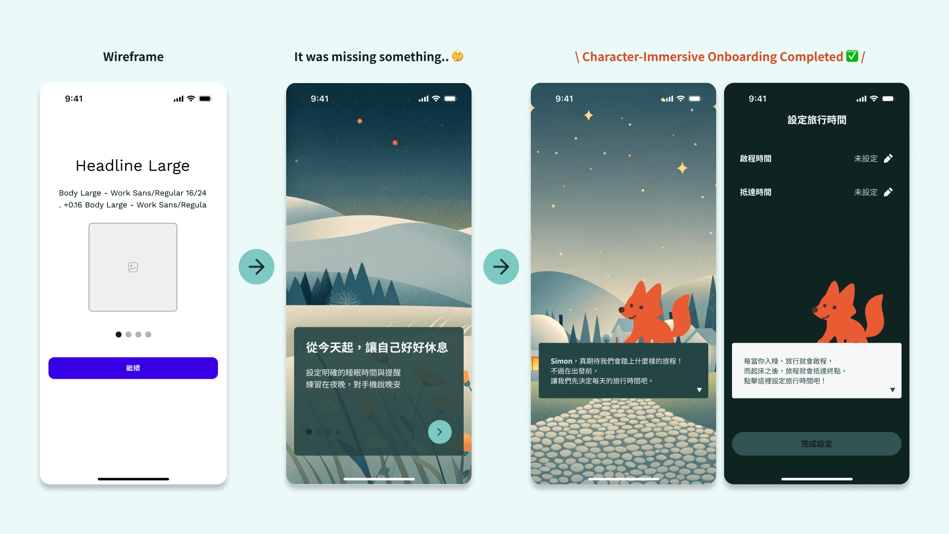
Early on, we took the common "feature-driven" approach, introducing the product's features page by page to help users get started quickly. However, for our target users — who lean toward casual entertainment — this approach lacked appeal and character immersion, especially since we were designing a gamified app. So we switched to character dialogue to establish the world of Dream Traveler, effectively boosting users' immersion and motivation to explore.
2Home Screen
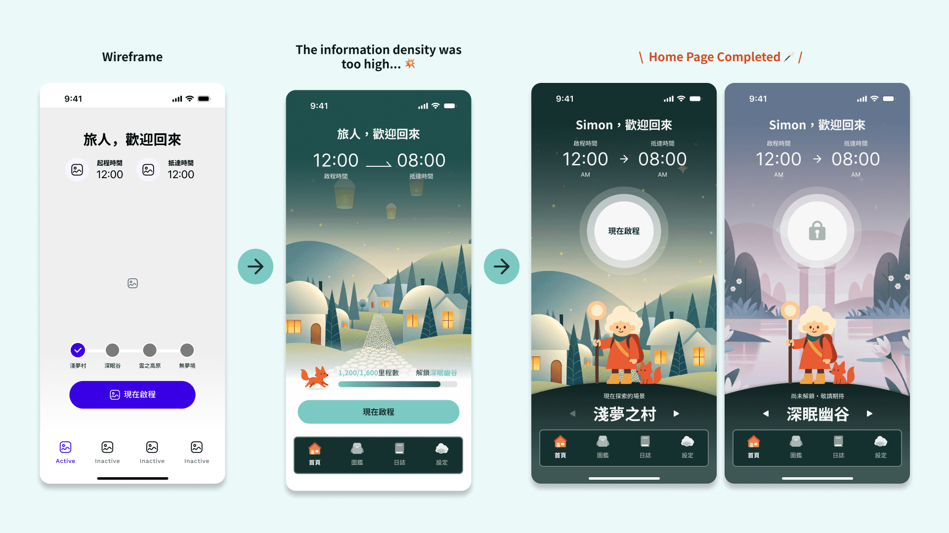
The early home screen used the currently unlocked location as its background, paired with an unlock progress bar to encourage users to keep a stable sleep routine. However, for users who are already tired at bedtime, the screen still carried too much information, and "location selection" was buried too deep to feel intuitive. So we restructured the home screen: a streamlined layout that shows the journey time, scenes that can be switched by swiping directly, and a clearer CTA button — strengthening both usability and visual artistry.
Outcome & Reflection
Result Validation
- Engineering Feasibility
- Selected for the "AAPD × Hexschool | Design-to-Frontend Product Development Camp," with several pages built out as static front-end pages. If the project continues, usability testing with target users would guide further iteration.View
- Finding Consensus Amid the Unfamiliar
- This was my first time collaborating with four to five other designers, and it was also the core goal I set for joining this program. Along the way, I came to deeply understand that a communication framework with effective communication, together with a task-tracking mechanism, are the foundation of how a team operates. Through frequent discussion and check-ins — and by seeking consensus across differing viewpoints — we kept the team aligned on our design goals throughout.
- Bold Experiments, Breaking Old Frames
- Early in the design process, it was easy to be held back by existing habits — drawing straight from the wireframe without thinking deeply about what presentation would truly fit. By "listening more, looking more, and doing more," and through the team's iterative experiments and style convergence, we not only came to deeply understand how design logic differs between light and dark modes, but also shaped a truly distinctive visual style for Dream Traveler.
Partner Feedback
YPINPIN
Frontend Engineer
Thanks to the design team for the beautiful design files — we had a regular weekly meeting to work through issues, and it was really efficient!
Heather Chiu
UI/UX Designer
Thanks to everyone for burning the midnight oil (?) for this project — through constant discussion and aligning on each other's ideas, we reached our shared goal: moving forward into the Hexschool frontend camp collaboration!